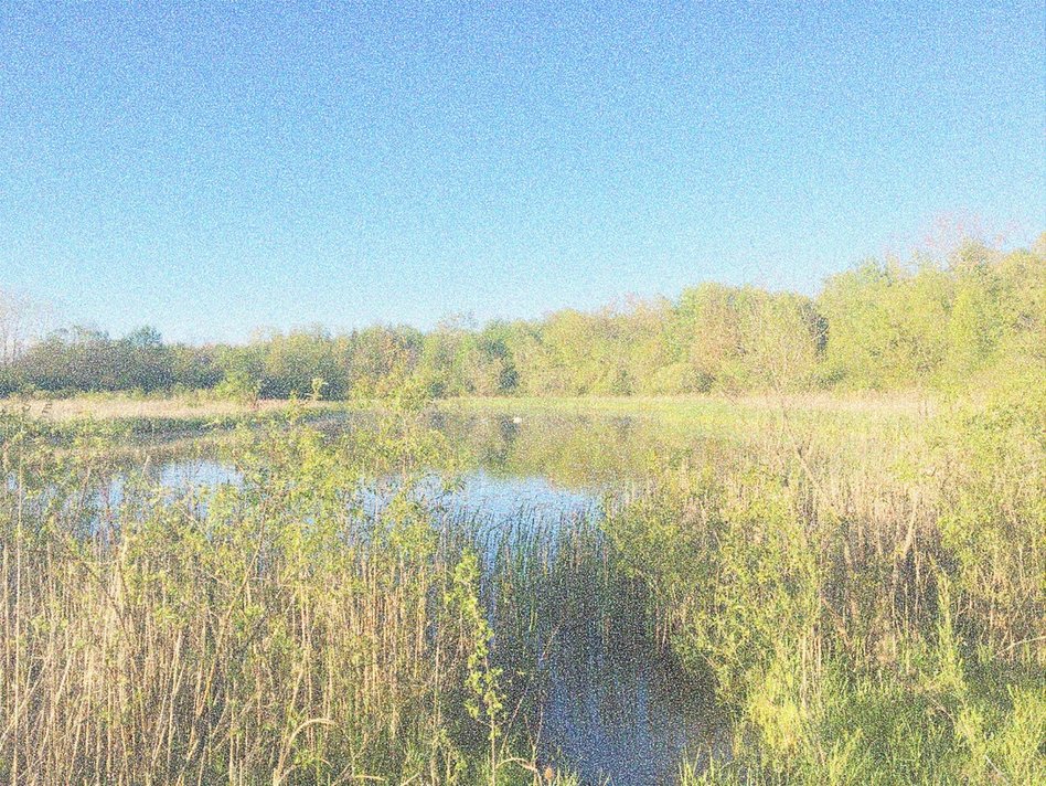
JUST A POND//
This photo gives me real life anxiety. I absolutely can't stand ponds. They're just dirty little un-manicured lakes. Everything around a pond is wild and out of control and just a big mess. They don't get gradually deeper like nearly every other type of body of water - literally even swimming pools are like this. No, you step into a pond and you're going dooooooooowwwwwwwnnn. As you can probably guess, this did happen to me.
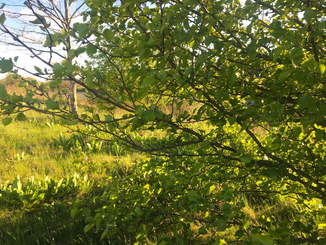
SPINACH TREE//It was getting cold and I needed to take one last picture. To be honest, I don't like this photo much. In landscape picture or pictures of nature in general, there is just too too much green. So much so that everything just blends together in a bland earthy mass. I appreciate photos with various different colors, patterns, textures, etc. This photo is just the opposite. So 'blah.'
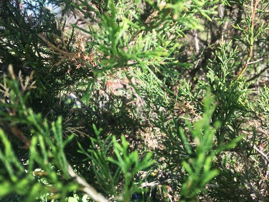
UP CLOSE AND PINE//I was pleasantly surprised that my the camera on my iPhone 6s was able to focus and pick up the amount of detail that it did when taking this picture. This tree was a little gem among the many, many, many plain oaks. I also really liked how there were little specs of orange amidst the different shades of green pines. I also like how there isn't really a focal point. May it's just the way I'm looking at it, but what I see is a mixture of parts that are in and out of focus, which I think makes the photo more interesting to look at.
|
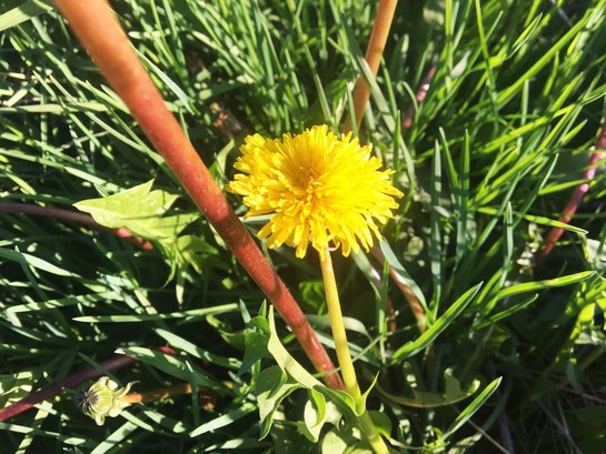
WEEDS//Don't try to debate with me: dandelions are the prettiest weeds in existence. Honestly, when I was younger, refused to believe that these vibrant, golden plants were what my dad used so much Round Up to kill. There was a field behind my elementary school that was completely overgrown with these things. My friends and I would roll around in them, make flower crowns with them and play the game "He Loves Me, He Loves Me Not" with them each and everyday we could. I most definitely prefer these over some real flowers.
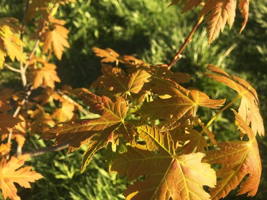
AUTUMN OR SPRING?//I put my two favorite photos next to each other. They are both close up shots and really focus in on minute details. As I mentioned before, I prefer nature photos that have colors other than green and this picture is beautiful example. As I walked through the LeForge Nature Preserve, my eyes quickly glanced over the rolling grassy hills and identical looking trees searching for pops of color. I was immediately drawn to this tree, which looked like it was a little developmentally challenged, still stuck in fall while the surrounding ones were already ready and looking forward to spring.
|
|
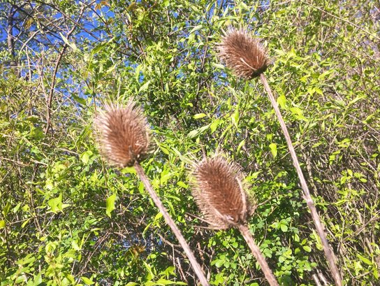
POKES//
I have no idea what these things are called. What I do know, however, is how these things used to terrorize me as a child. They're like the demon child of a porcupine and cactus, if that were possible. Getting these things stuck to my clothes, or worse my skin, honestly seemed like the end of the world. Even so, this didn't stop me from using them to torment my two younger sisters.
|
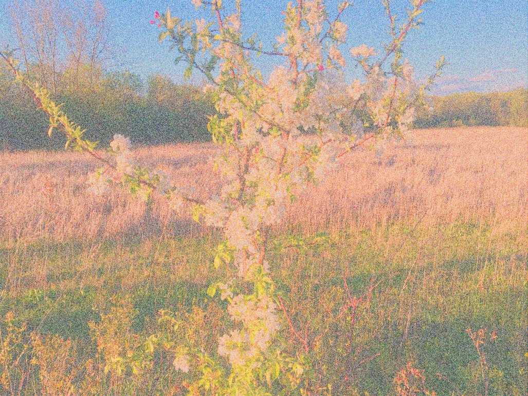
GRAPE SKY//
The color of the sky in this pictures reminds me of grape flavored Bubblicious chewing gum - after it's been chewed for awhile anyway. Either way, I really really like it. This and the photo below are definitely tied for my favorite oil painting pictures. I want to just jump through my computer screen and run wild through this field. The only issue I have with this photo is the fact that the tree trunks didn't pick up that much of the Monet image. They still look the same, which is slightly annoying.
JAPANESE CHERRY BLOSSOM//The title of this image pays homage to one of my favorite scents at Bath & Body Works. My first full set from the store, including a body wash, spray and lotion, was in the scent, Japanese Cherry Blossom. I don't know where cosmetics companies get off using culturally specific names to label their projects. Like I highly doubt that a cherry blossom growing in Japan smells like the highly processed and chemical containing potions I buy from places like Bath & Body Works. Anyway, though, this picture really reminds me of the image that a lot of companies put on the bottles with any type of "cherry blossom" name.
GREENSPACE// |
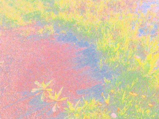
RADIOACTIVE PUDDLE//I'm not sure what I did to make this picture look the way it does. It reminds me of those super weird rave videos from the 90s. You know which ones I'm talking about, right? The ones where it looks like everyone's homeless and on acid, those ones. I do like the pink, green and yellow color combination though.
|
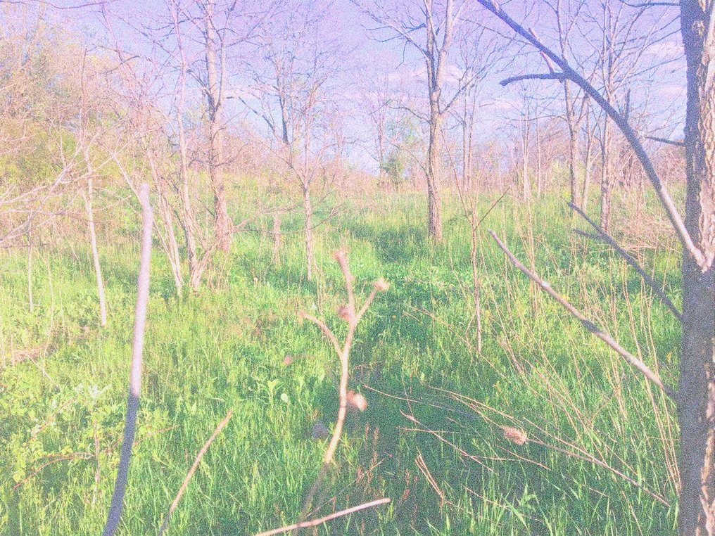
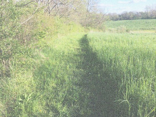
Yet another picture I don't like... My photos were due the next day and the Real Housewives of Atlanta reunion episode was coming on soon so quality just wasn't in the forefront of my mind, I suppose. This photo is of a grass path in the nature reserve. I don't like grass paths. I'm always terrified that either a critter or deranged human being is going to jump out at me or grab me. I also just don't like the feeling of grass scratching my feet as I walk on the path.
